





 Multi-Vendor & Complex SaaS Marketplaces
 Modern Headless & Jamstack Web Development
 High-End Corporate & Specialized Business Websites
 Advanced API, Checkout & Database Troubleshooting
Sticky Header Overlapping Content: Fix Z-Index Layout Errors
Sticky headers covering your copy? Learn the real CSS stacking causes, DIY z-index and offset fixes, and when Fixwebnode should step in before visitors bounce.
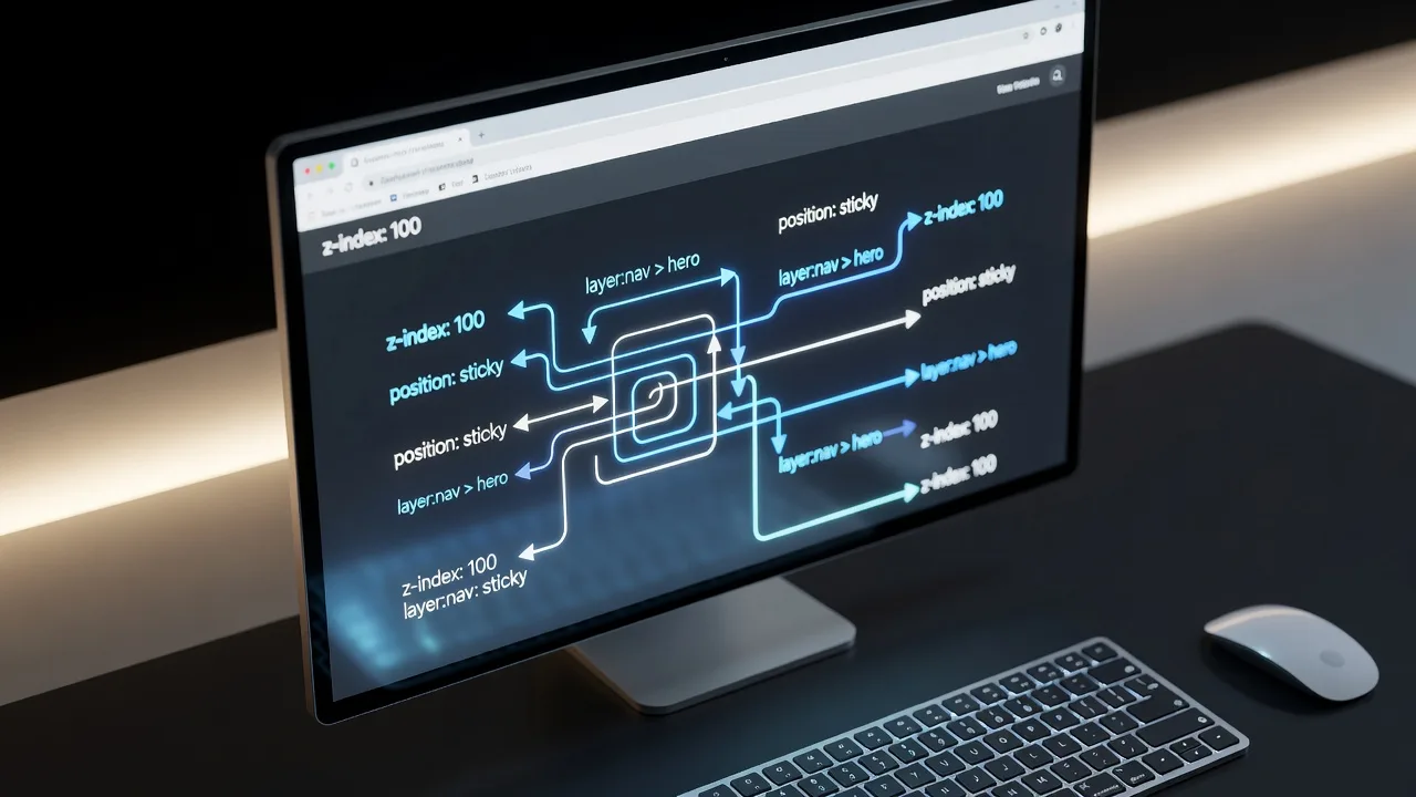
If your sticky or fixed site header sits on top of headlines, forms, or buttons after scroll, you are dealing with a layer and offset problem—not “bad luck” in the browser. Homeowners running a local service site and small businesses with brochure or shop pages hit this constantly after a theme update, page-builder tweak, or custom CSS paste. This guide stays on that problem: why sticky headers overlap content, how z-index and stacking contexts go wrong, and the exact DIY steps to repair them. When the cascade is tangled across plugins and templates, Fixwebnode can audit the live layout and restore clean layering without a full redesign.
Why sticky header overlap matters for layout and trust
A header that covers the first line of a hero, hides “Add to cart,” or clips mobile nav labels looks broken. Visitors assume the site is unfinished. Search and accessibility tools also struggle when focusable controls sit under an opaque bar. The root causes are usually mechanical: missing top offset equal to header height, a stacking context that traps or elevates the wrong layer, overflow on an ancestor that breaks position: sticky, or a mobile drawer painted at the wrong z-index. Fixing those restores readable content and predictable scroll behavior on desktop and phone.
Fixwebnode works this class of front-end layout defect as a direct specialist engagement—not a bid board. If you need regional coverage notes while you plan the fix, see all service areas for where support is coordinated.
Common sticky header and z-index issues
These problems look similar in a screenshot but have different roots. Match your symptoms before you change random z-index numbers.
1. Content starts under the bar (no scroll offset)
Symptom: On first load, the H1, logo lockup in the hero, or a top banner form is half-hidden behind a fixed or sticky header. Scrolling does not “reveal” space—the content was never padded or translated below the header height.
2. Z-index “ignored” because of a new stacking context
Symptom: You set z-index: 9999 on the header, yet a card, sticky sidebar, map embed, or cookie banner still paints over the menu—or the reverse, and dropdowns vanish under page sections. Parent rules like transform, filter, opacity below 1, isolation, or will-change created a local stacking context so the header’s z-index only competes inside that box.
3. Sticky fails or clips when a parent uses overflow
Symptom: position: sticky; top: 0 works in a minimal CodePen but not on your theme. The bar scrolls away, jumps, or the page feels like the header is trapped inside a scrolling panel. Often overflow: hidden, auto, or scroll on body, a wrapper, or a page-builder “section” breaks sticky containing blocks.
4. Mobile menu / mega-menu underlap and double-layer chaos
Symptom: Desktop looks fine; on narrow viewports the hamburger panel opens behind the hero slider, or open dropdowns cover the wrong block and cannot be clicked. Touch targets sit under a translucent sticky bar after orientation change because height and z-index were only tuned for desktop.
How to fix each sticky header overlap issue
Work in a staging copy or browser DevTools first. Prefer theme child CSS or a small custom CSS plugin over editing parent theme files you will lose on update.
Fix issue 1 — Give the page a top offset that matches header height
Measure the rendered header, then reserve that space on the first content container (or use a CSS variable so sticky height changes stay in sync).
Step 1 — Measure the live header
In Chrome or Firefox DevTools, select the header element and note its height in pixels (include borders and safe-area padding on notched phones).
Step 2 — Prefer a shared custom property
:root {
 --site-header-height: 72px; /* replace with measured value */
}

.site-header {
 position: sticky; /* or fixed, if that is your design */
 top: 0;
 z-index: 1000;
 height: var(--site-header-height);
}

/* If header is position: fixed, offset the content root */
body.fixed-header-on .site-content,
main#main {
 padding-top: var(--site-header-height);
}

/* If header is sticky inside normal flow, avoid double spacing;
 only pad heroes that use negative margin or absolute children */
.hero-under-transparent-header {
 padding-top: calc(var(--site-header-height) + 1.5rem);
}
Step 3 — Account for admin bars and stacked announcement strips
/* Example: WordPress admin bar + site header */
body.admin-bar {
 --wp-admin-bar: 32px;
}
@media screen and (max-width: 782px) {
 body.admin-bar { --wp-admin-bar: 46px; }
}
body.admin-bar .site-header {
 top: var(--wp-admin-bar);
}
body.admin-bar.fixed-header-on main#main {
 padding-top: calc(var(--site-header-height) + var(--wp-admin-bar));
}
Step 4 — Verify
Hard-refresh, check the H1 fully visible at load, tab through links in the hero, then resize to mobile widths. If a second promo bar appears conditionally, recalculate --site-header-height with JS on resize only when the bar’s height actually changes.
When to call Fixwebnode: multiple headers (desktop/mobile clones), scroll-triggered shrink headers, or page builders that inject conflicting padding on every section.
Fix issue 2 — Repair stacking contexts instead of infinite z-index
Raising z-index alone fails when an ancestor already formed a stacking context. Flatten or re-home the header in the DOM layer that should win globally.
Step 1 — Find the trapping ancestor
In DevTools, inspect the header and walk up parents. Flag any with transform, perspective, filter, opacity not 1, mix-blend-mode, isolation: isolate, contain: paint, or will-change: transform.
Step 2 — Remove needless context creators on wrappers
/* Risky pattern: whole-page motion wrapper trapping the header */
.page-wrapper {
 /* transform: translateZ(0); remove if only used as a “GPU hack” */
 /* opacity: 0.99; remove */
 /* filter: none; ensure not filtering */
}

.site-header {
 position: sticky;
 top: 0;
 z-index: 1000; /* meaningful within the root stacking context */
}

/* Keep decorative transforms on inner elements, not the header’s parents */
.hero-art {
 transform: translateY(12px);
}
Step 3 — Define a small, documented layer scale
:root {
 --z-base: 1;
 --z-sticky-section: 10;
 --z-header: 1000;
 --z-dropdown: 1100;
 --z-modal: 2000;
 --z-toast: 2100;
}

.site-header { z-index: var(--z-header); }
.site-header .nav-dropdown { z-index: var(--z-dropdown); }
.modal-overlay { z-index: var(--z-modal); }
Step 4 — Verify stacking
Open the menu over a map iframe, video, and sticky product summary. Confirm dropdowns appear above page chrome but below modals. If a third-party widget forces an absurd z-index, isolate that widget in its own controlled wrapper rather than matching 999999 everywhere.
When to call Fixwebnode: minified theme bundles, conflicting “sticky elements” plugins, or canvas/WebGL embeds that composite above HTML without a clear owner in CSS.
Fix issue 3 — Restore sticky by fixing overflow and containing blocks
Sticky positions relative to the nearest scrollport. Overflow on ancestors changes that scrollport or prevents sticking.
Step 1 — Audit overflow on the chain from header to body
/* Temporary diagnostic outline in DevTools or a short-lived CSS file */
body * {
 /* outline: 1px solid rgba(255,0,0,.15); enable only while debugging */
}

html, body {
 overflow-x: clip; /* prefer clip over hidden when you only need to kill horizontal scroll */
}

/* Remove overflow hidden on main layout shells unless truly required */
.site-container,
.page-builder-section,
.elementor-section,
.wp-block-group {
 overflow: visible;
}
Step 2 — Prefer sticky on the header element itself, not a distant grandparent
header.site-header {
 position: sticky;
 top: 0;
 z-index: var(--z-header, 1000);
 background: #fff; /* opaque background so content never shows through unreadably */
}
Step 3 — If design requires fixed, pair it with the offset from issue 1
header.site-header.is-fixed {
 position: fixed;
 inset-inline: 0;
 top: 0;
}
body.has-fixed-header {
 padding-top: var(--site-header-height);
}
Step 4 — Verify
Scroll long pages, nested tabs, and sections with their own overflow. Sticky should remain pinned to the viewport top (plus admin bar offset if present) without detaching halfway down a builder section.
When to call Fixwebnode: overflow is required for carousels or parallax and cannot be set to visible without breaking another module—needs a structural re-wrap, not one line of CSS.
Fix issue 4 — Mobile nav layers and safe-area heights
Treat the open mobile panel as its own layer above page content but coordinated with the sticky bar height and device safe areas.
Step 1 — Lock a mobile-specific layer and full-viewport panel
.nav-toggle { z-index: var(--z-header); }

.mobile-nav-panel {
 position: fixed;
 top: var(--site-header-height);
 right: 0;
 bottom: 0;
 width: min(20rem, 100vw);
 z-index: var(--z-dropdown);
 overflow-y: auto;
 -webkit-overflow-scrolling: touch;
 padding-bottom: env(safe-area-inset-bottom, 0);
}

body.mobile-nav-open {
 overflow: hidden; /* lock background scroll while open */
}
Step 2 — Keep the sticky header opaque while the panel is open
body.mobile-nav-open .site-header {
 background: #fff;
 box-shadow: 0 1px 0 rgba(0,0,0,.08);
}
Step 3 — Retune height on orientation change
function setHeaderHeightVar() {
 var header = document.querySelector('.site-header');
 if (!header) return;
 var h = Math.ceil(header.getBoundingClientRect().height);
 document.documentElement.style.setProperty('--site-header-height', h + 'px');
}
window.addEventListener('load', setHeaderHeightVar);
window.addEventListener('resize', setHeaderHeightVar);
setHeaderHeightVar();
Step 4 — Verify on real devices
Open the menu over sliders and sticky CTAs, rotate the phone, and confirm every link receives taps. Check that focus outlines are not clipped by overflow: hidden on the panel.
When to call Fixwebnode: dual menus (builder + theme), off-canvas libraries fighting sticky headers, or checkout headers that must stay usable with payment iframes.
When DIY is enough vs when to book Fixwebnode
DIY is enough when you control one child stylesheet, can measure a stable header height, and DevTools shows a clear overflow or stacking culprit you can remove safely. The numbered steps above cover most brochure sites and simple shops.
Book a specialist when overlap returns after every plugin update, when several sticky products (header, add-to-cart bar, chat widget, cookie consent) fight for the top layer, or when the “header” is assembled from multiple absolute pieces inside a page builder. That is layout architecture work: DOM order, controlled z-scale, and regression checks on key templates.
Fixwebnode is the direct provider for this front-end repair path. The same team coordinates broader technical rescue work across regions listed on the service areas hub—including specialized server-side jobs such as Fix Corrupted Linux APT Sources.list - Alabama Expert Support and Fix Corrupted Linux APT Sources.list in Colorado when a site’s host environment is part of a larger outage story. For sticky header and z-index layer errors specifically, keep the brief focused on URLs, breakpoints, and a short screen recording of the overlap.
Get the header out of your content
Sticky header overlap is almost never mysterious once you separate offset (space for the bar) from stacking (who paints on top) and containing blocks (what overflow and transform do to sticky). Apply the issue-matched steps, verify at desktop and mobile widths, and keep a tiny z-index scale so the next widget does not restart the arms race.
If you want a specialist to untangle theme CSS, builder sections, and third-party widgets in one pass, start a conversation with Fixwebnode and share the page that misbehaves. You will get practical layout repair aimed at readable content and stable menus—not a generic redesign pitch.