



 Multi-Vendor & Complex SaaS Marketplaces
 Modern Headless & Jamstack Web Development
 High-End Corporate & Specialized Business Websites
 Advanced API, Checkout & Database Troubleshooting
Sticky Header Overlapping Content: Fix Z-Index Layout Errors
Sticky headers covering your hero, menus, or CTAs? Learn the real z-index and stacking-context causes, step-by-step CSS fixes, and when Fixwebnode should take over the layout repair.
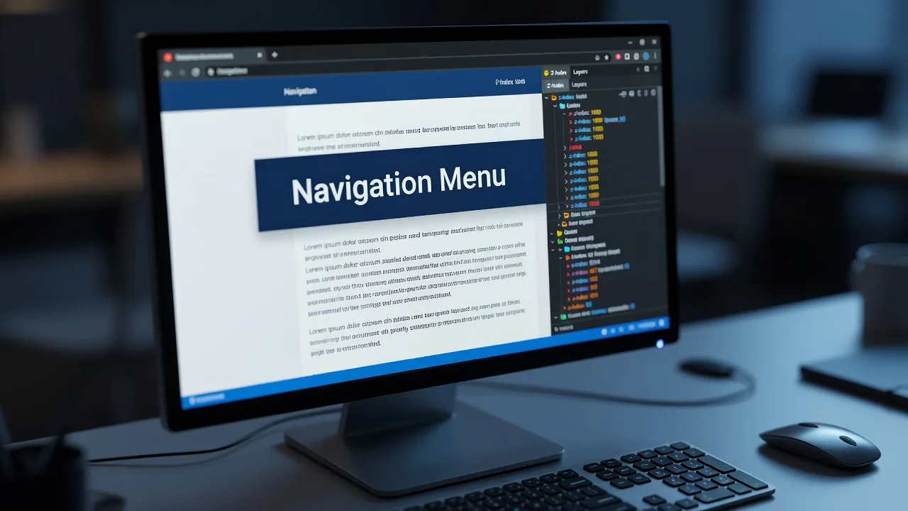
If your sticky header is sitting on top of headlines, buttons, or form fields—or vanishing under a mega-menu—you have a stacking and layout problem, not a “design preference.” This guide walks homeowners and small-business site owners through the most common sticky-header overlap failures, the DIY CSS checks that usually clear them, and when it is smarter to book a specialist at Fixwebnode before you break production styles.
Sticky headers use position: sticky or fixed plus a stacking order. When that order collides with transforms, overflow, or competing z-index values, content disappears under the bar or the bar sinks under page chrome. The fixes below stay on that problem only: diagnose the layer, restore a sane stack, and verify on real viewports.
Why sticky header z-index errors matter
A header that covers the first line of copy, hides “Buy” or “Contact,” or clips a mobile drawer costs trust and conversions. Search users bounce; mobile visitors cannot open the menu; accessibility tools announce content that is visually blocked. Fixing z-index layer layout errors restores readable hierarchy without redesigning the whole brand.
Fixwebnode approaches this as production front-end repair: inspect computed styles, isolate stacking contexts, and ship minimal CSS or theme overrides. If you also maintain servers or package sources in other regions, the same specialist network covers broader ops work across all service areas—but the steps here stay focused on sticky header overlap.
Common sticky header overlap issues
These problems look similar in screenshots but have different root causes. Match your symptom before you raise every z-index to 99999.
1. Header sits under page sections or floating widgets
Symptom: On scroll, cards, sidebars, chat bubbles, or hero media paint over the sticky bar. The logo and nav flicker or disappear mid-page.
2. Sticky fails inside a parent with overflow or transform
Symptom: The header is marked sticky in CSS but never sticks—or sticks only inside a short wrapper—while lower content still collides with a fixed clone or admin bar.
3. Fixed header covers the top of every section and in-page anchors
Symptom: Jump links land with the heading hidden under the bar. The first paragraph of landing sections is unreadable until the user scrolls awkwardly.
4. Mobile drawer / mega-menu trapped under content or the bar itself
Symptom: Hamburger opens but links are untappable; dropdowns appear behind hero images; overlay dimmers sit above the menu items.
How to fix each z-index layer layout error
Fix 1 — Header buried under sections or widgets
Competing components often ship with high z-index values (chat, cookie banners, sticky CTAs). Your header needs a deliberate stack tier and isolation, not a random large number.
Step 1 — Inventory stacking values in DevTools
Open the page, inspect the header and the overlapping node, and note computed position, z-index, and whether a parent creates a stacking context (transform, filter, opacity < 1, isolation, will-change).
Step 2 — Define a small, documented scale
:root {
 --z-base: 1;
 --z-header: 100;
 --z-dropdown: 200;
 --z-overlay: 300;
 --z-toast: 400;
}

.site-header {
 position: sticky; /* or fixed, if that is your pattern */
 top: 0;
 z-index: var(--z-header);
 background: #fff; /* opaque bg prevents “see-through” collisions */
}
Step 3 — Pull rogue widgets into the same scale
.chat-launcher { z-index: var(--z-toast); }
.cookie-banner { z-index: var(--z-overlay); }
.section-card { z-index: var(--z-base); position: relative; }
Step 4 — Verify
Scroll the full homepage and an interior page. Confirm the bar stays above section chrome but below intentional modals. If a third-party script injects inline z-index, override with a more specific selector or load-order fix rather than another global 999999.
Call Fixwebnode when the overlap comes from minified theme bundles or page-builder layers you cannot safely edit.
Fix 2 — Sticky broken by overflow, transform, or filter on ancestors
position: sticky is relative to the nearest scroll ancestor. A parent with overflow: hidden, auto, or scroll, or with transform / filter / perspective, creates a containing block or stacking context that traps the header and scrambles layer order with siblings.
Step 1 — Find the trapping ancestor
/* In DevTools console, with the header selected in Elements: */
(function walk(el) {
 while (el && el !== document.body) {
 const s = getComputedStyle(el);
 console.log(el, {
 overflow: s.overflow,
 transform: s.transform,
 filter: s.filter,
 isolation: s.isolation
 });
 el = el.parentElement;
 }
})($0);
Step 2 — Remove or relocate the trap
/* Prefer: allow overflow on outer layout wrappers */
.layout-shell {
 overflow: visible; /* was hidden for rounded corners */
}

/* Move decorative transform to an inner element, not the sticky parent */
.hero-shell { transform: none; }
.hero-shell .hero-art { transform: translateY(12px); }
Step 3 — Prefer sticky on a top-level header node
body > .site-header {
 position: sticky;
 top: 0;
 z-index: var(--z-header);
}
Step 4 — Verify
Resize across breakpoints. Sticky should engage against the viewport (or the true page scroller), and the bar should no longer paint under transformed hero stacks.
Call Fixwebnode when the trap lives in a locked page-builder section or a framework layout you cannot fork cleanly.
Fix 3 — Fixed/sticky bar covers section tops and anchor targets
This is a layout offset problem tied to header height, often mistaken for pure z-index. The bar is correctly on top; content simply starts at y=0 underneath it.
Step 1 — Measure header height
const h = document.querySelector('.site-header')?.offsetHeight || 0;
document.documentElement.style.setProperty('--header-h', h + 'px');
Step 2 — Offset document anchors and first sections
html {
 scroll-padding-top: var(--header-h, 72px);
}

.section-anchor,
main > section:first-child {
 scroll-margin-top: var(--header-h, 72px);
}

/* Optional body offset if the header is position:fixed */
body.has-fixed-header {
 padding-top: var(--header-h, 72px);
}
Step 3 — Keep background opaque while scrolling
.site-header.is-stuck {
 background: rgba(255, 255, 255, 0.98);
 backdrop-filter: blur(6px);
 box-shadow: 0 1px 0 rgba(0, 0, 0, 0.06);
}
Step 4 — Verify
Click every in-page nav link and load URLs with hash fragments. Titles must clear the bar. Test with a taller logo on tablet widths where height changes.
Call Fixwebnode when header height is dynamic (promo strips, logged-in admin bars, multilingual menus) and needs a small script plus CSS coordination.
Fix 4 — Mobile menu or mega-menu stuck in the wrong layer
Dropdowns and full-screen drawers need a higher tier than the bar’s content row, but lower than true modal dialogs. They must also escape overflow-clipped parents.
Step 1 — Portal the open menu to a known stacking tier
.site-header {
 z-index: var(--z-header);
}
.site-header .nav-panel.is-open {
 position: fixed; /* escape overflow parents */
 inset: var(--header-h, 72px) 0 0 0;
 z-index: var(--z-dropdown);
 background: #fff;
}
.nav-backdrop.is-open {
 position: fixed;
 inset: 0;
 z-index: calc(var(--z-dropdown) - 1);
}
Step 2 — Ensure interactive content is not covered
.nav-panel a,
.nav-panel button {
 position: relative;
 z-index: 1;
}
/* Avoid pointer-events:none on the open panel wrapper */
Step 3 — Check focus and scroll lock
document.body.classList.add('nav-open');
/* CSS: body.nav-open { overflow: hidden; } */
Step 4 — Verify
On a real phone or device mode, open the menu over a hero video, a map embed, and a sticky add-to-cart bar. Every link must receive taps; the backdrop must dim content without hiding menu labels.
Call Fixwebnode when the menu is rendered inside Shadow DOM, an iframe checkout, or a theme file compiled from inaccessible source.
When DIY is enough vs when to book Fixwebnode
DIY is enough when you can edit theme CSS or a child stylesheet, reproduce the bug in DevTools, and the stack only involves your header, sections, and one or two widgets. Use the numbered steps above, commit the change, and retest on mobile and desktop.
Book a specialist when overlap returns after plugin updates, when page builders regenerate inline styles, when sticky interacts with third-party chat and A/B scripts, or when you need a durable design-token z-index system across many templates. Fixwebnode is the direct specialist for this class of front-end layout repair—not a freelance marketplace—so you talk through the live symptom and get targeted fixes on the sticky header stack.
Teams that already rely on Fixwebnode for infrastructure oddities sometimes pair layout work with ops tickets such as Expert Support when the same business site sits on a Linux host that also needs package-source repair. Keep those tracks separate from the CSS work, but use service areas coverage when your property or office stack spans more than one region.
Get the sticky header layer fixed properly
Sticky header overlapping your content is almost always a solvable mix of z-index tiers, stacking contexts, overflow traps, and scroll offset. Work through the four issue paths above first; if the bar still eats headlines or hides mobile nav, bring a specialist in before you paper over the bug with ever-larger z-index values.
Start a conversation with Fixwebnode about your sticky header and z-index layer layout errors. Share a URL, the viewport where it breaks, and what you already tried—we will help you restore a clean, usable header stack without rewriting the whole site.