

 Multi-Vendor & Complex SaaS Marketplaces
 Modern Headless & Jamstack Web Development
 High-End Corporate & Specialized Business Websites
 Advanced API, Checkout & Database Troubleshooting
Mobile Menu Broken? Fix a Hamburger Nav That Won't Click
Hamburger icon visible but dead? Learn the real causes—overlays, CSS pointer traps, and broken toggles—plus numbered DIY fixes before you book Fixwebnode for stubborn mobile nav failures.
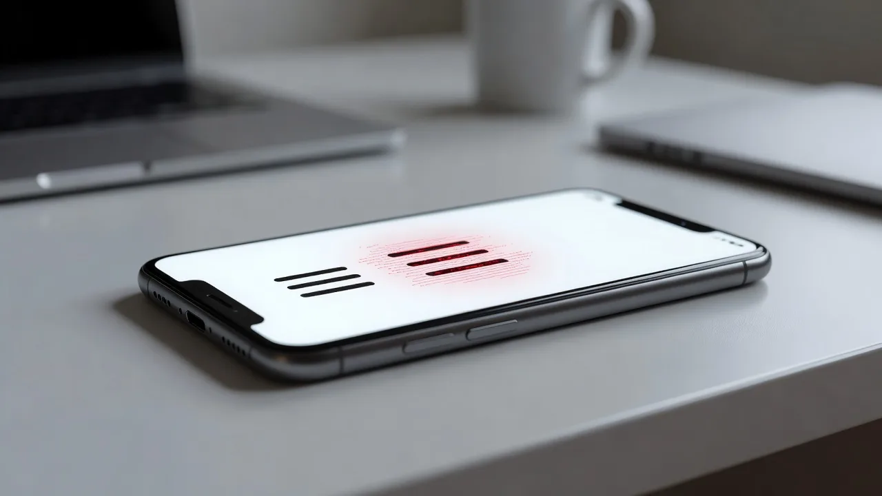
If your site’s three-line “hamburger” icon shows on phones but never opens the menu, visitors bounce and calls drop. This guide walks homeowners and small-business owners through the most common reasons a mobile menu will not click, with practical DIY checks you can run in the browser, then clear signals for when to hand the job to a specialist.
Fixwebnode works on production sites every week where the desktop nav is fine and the mobile drawer is dead. If you need hands-on help after the steps below, talk to a Mobile App Developer who diagnoses front-end and responsive navigation issues directly—not through a bidding board.
Why a dead hamburger menu hurts more than it looks
On a phone, the hamburger is often the only path to Contact, Services, and Booking. When taps do nothing, users assume the site is broken. Typical symptoms: the icon animates but no panel appears; the icon does nothing at all; the menu opens then immediately closes; or only half the links respond. Most of these failures come from stacking order, CSS that blocks pointer events, missing or conflicting JavaScript, or theme/plugin collisions after an update—not from “the phone being wrong.”
The fixes below stay on that problem: a hamburger navigation that will not click. Work through them in order on a staging copy or with browser DevTools open so you can undo changes safely.
Common issues when the hamburger will not click
These are distinct root causes we see repeatedly. Match your symptoms before changing code.
- Invisible overlay blocking the button — A full-width header bar, cookie banner, sticky announcement, or pseudo-element sits above the icon. You see the icon, but every tap hits the layer on top.
- CSS pointer-events or overflow trap —
pointer-events: noneon the button or a parent, oroverflow: hiddenon a wrapper that clips the open panel and swallows taps. - Toggle script never bound or double-bound — The click/touch listener is missing after a theme update, runs before the DOM node exists, or two scripts fight (one opens, one closes instantly).
- Touch target and z-index mismatch on real devices — Works in desktop responsive mode but fails on actual phones because the hit area is under 44×44px or a fixed footer/chat widget steals the touch.
- Plugin or page-builder CSS after an update — A slider, mega-menu, or optimization plugin injects
display/visibilityrules that hide the mobile panel only below a breakpoint.
Issue 1: Invisible overlay blocking the hamburger
Symptoms: Icon looks normal; hover/active styles may even flash; nothing opens. Desktop menu is fine.
DIY resolution
- On your phone or in Chrome DevTools device mode, long-press is not required—open DevTools, enable the element picker, and tap the hamburger. Note which node highlights. If it is a banner,
#wpadminbar-style bar, or a full-bleeddivinstead of yourbutton.menu-toggle, you have an overlay. - In the Styles panel, temporarily set that overlay to
pointer-events: noneor lower itsz-indexbelow the toggle (for example toggle atz-index: 1001, overlay at999). Retest the tap. - Find the permanent rule in your theme custom CSS, header template, or cookie-banner settings. Raise the menu button and open panel together, for example:
.site-header .menu-toggle,
.site-header .main-navigation.toggled {
 position: relative;
 z-index: 10050;
}
.cookie-banner,
.announcement-bar {
 z-index: 1000;
}- Clear caches (plugin, CDN, server) and retest on a real phone, not only the emulator.
If the blocking layer is injected by a closed page-builder module you cannot edit, stop DIY and book a specialist rather than fighting minified CSS.
Issue 2: pointer-events, overflow, and clipped panels
Symptoms: Menu “opens” in the DOM (a .toggled or .is-open class appears) but you cannot tap links, or the panel is cut off mid-screen.
DIY resolution
- Inspect the hamburger and its parents for
pointer-events: none. Remove or override it on the interactive controls only:
.menu-toggle,
.menu-toggle *,
.nav-drawer a {
 pointer-events: auto !important;
}- Check ancestors for
overflow: hiddenoroverflow: autoonheader,.site-header, or a sticky wrapper. A drawer that animates toheight: 100vhinside anoverflow: hiddenheader will never receive taps outside that box. Move the drawer tobodylevel in the template, or change the header overflow when open:
body.nav-open .site-header {
 overflow: visible;
}
.nav-drawer {
 position: fixed;
 inset: 0 auto 0 0;
 width: min(100%, 20rem);
 z-index: 10060;
 overflow-y: auto;
}- Confirm the open state sets
visibilityandopacitycorrectly and does not leaveheight: 0ortransformoff-screen without a matching transition end state. - Retest landscape and portrait; some themes only set overflow rules for one orientation.
When the markup is locked inside a builder and the drawer cannot be relocated safely, that is a Fixwebnode job—template surgery without breaking the desktop header.
Issue 3: JavaScript toggle never fires (or fires twice)
Symptoms: No class change on click; or class toggles on then off in one tap; console shows errors referencing null or addEventListener.
DIY resolution
- Open the browser console on the mobile breakpoint. Click the icon. Note any red errors (missing
$, deferred script order, or “cannot read property of null”). - Confirm a single toggle control exists in the DOM, for example
button.menu-togglewith a matching panel id inaria-controls. - If your theme expects jQuery and a plugin moved scripts to the footer without dependencies, restore proper order or bind with vanilla JS after DOM ready:
document.addEventListener('DOMContentLoaded', function () {
 var btn = document.querySelector('.menu-toggle');
 var nav = document.querySelector('#site-navigation');
 if (!btn || !nav) return;
 btn.addEventListener('click', function (e) {
 e.preventDefault();
 e.stopPropagation();
 var open = nav.classList.toggle('toggled');
 btn.setAttribute('aria-expanded', open ? 'true' : 'false');
 document.body.classList.toggle('nav-open', open);
 });
});- Search the codebase or plugin list for a second mobile-menu script (often “sticky header,” “mega menu,” or optimization “defer all JS”). Disable one at a time on staging until the double-toggle stops.
- Ensure touch devices are covered: prefer
click(which fires after touch on modern mobile browsers) or pairpointerupcarefully; avoid binding bothtouchstartandclickwithoutpreventDefaultcoordination or you will open-and-close in one gesture.
If the site uses a compiled bundle you cannot edit, or errors point at minified vendor code, escalate rather than patching production with random !important scripts.
Issue 4: Works in DevTools, fails on a real phone
Symptoms: Emulator clicks work; customer iPhones/Androids do nothing. Often a chat widget, “back to top” button, or fixed CTA overlaps the icon only on device pixel ratios or safe-area insets.
DIY resolution
- Test on an actual device over your LAN or a tunnel; do not trust desktop device mode alone for touch stacking.
- Increase the hit area without bloating the visual icon:
.menu-toggle {
 min-width: 44px;
 min-height: 44px;
 padding: 12px;
 position: relative;
 z-index: 10050;
}
.menu-toggle::before {
 content: "";
 position: absolute;
 inset: -8px;
}- Account for iOS safe areas so a fixed header does not sit under the notch while a floating button covers the control:
.site-header {
 padding-top: env(safe-area-inset-top);
}
.menu-toggle {
 margin-right: max(8px, env(safe-area-inset-right));
}- Temporarily hide third-party widgets (chat, popup, accessibility bar) via their settings. If the menu suddenly works, reposition that widget’s mobile CSS permanently.
Hardware-only failures mixed with custom apps or hybrid WebViews are a good time to involve Fixwebnode’s mobile-focused developers.
Issue 5: Theme or plugin CSS after an update
Symptoms: Menu worked last month; after a theme, WooCommerce, or “performance” plugin update, mobile nav is inert while desktop is unchanged.
DIY resolution
- On staging, disable non-essential plugins; re-enable one by one until the break returns. Note the culprit.
- Compare computed styles on
.main-navigationbefore/after. Look fordisplay: none !important,visibility: hidden, ormax-height: 0inside a max-width media query. - Add a narrow, late-loading child-theme override that only restores mobile visibility when toggled:
@media (max-width: 768px) {
 .main-navigation.toggled,
 .main-navigation.toggled ul {
 display: block !important;
 visibility: visible !important;
 max-height: none !important;
 opacity: 1 !important;
 }
}- Purge every cache layer again; many “fixes” fail only because HTML/CSS remained stale on the edge CDN.
If rolling back the plugin breaks checkout or forms, do not stay on an old insecure version—schedule proper repair.
When DIY is enough vs when to book Fixwebnode
DIY is enough when you can identify a single overlay, a clear pointer-events rule, or a one-line toggle in a child theme, and you have staging plus backups. Homeowners on simple brochure themes and small businesses with basic builders often resolve Issues 1–2 in under an hour.
Book a specialist when any of these apply: the header is a locked page-builder global; multiple scripts minified into one bundle; the menu fails only on specific devices; ecommerce checkout shares the same header; or previous “quick CSS” hacks stacked until the layout is fragile. Fixwebnode is a direct specialist for this class of front-end failure—useful across our service areas, including teams who already maintain industry sites such as website solutions for Canberra builders and construction specialists and professional website redesign for Melbourne, VIC businesses.
A pro visit typically means reproducing the bug on real devices, fixing markup/JS at the source, preserving accessibility (aria-expanded, focus traps, Esc-to-close), and checking that sticky headers, megamenus, and chat widgets still coexist after the repair.
Get the hamburger clicking again
A mobile menu that will not click is almost never “just the phone.” It is stacking order, CSS that blocks pointers, a toggle script that never bound, a touch target stolen by another widget, or an update that hid the panel at small breakpoints. Use the numbered checks above in order, verify on a physical device, and keep changes in a child theme or staging site.
If you would rather not dig through overlays and deferred scripts, start a conversation with Fixwebnode. Book time with a Mobile App Developer who will treat the hamburger failure as a production bug—diagnose, patch, and leave you with a menu customers can actually open.