


 Multi-Vendor & Complex SaaS Marketplaces
 Modern Headless & Jamstack Web Development
 High-End Corporate & Specialized Business Websites
 Advanced API, Checkout & Database Troubleshooting
Mobile Menu & Hamburger Nav Layout Repair — Australia
Get your Australia site’s hamburger menu opening cleanly on phones again—no half-broken drawers or missing links.
We repair responsive nav layouts for high-street shops, clinic booking pages, and regional small-business sites where most traffic arrives on mobile. Fixed scopes, plain-English handoff, and direct work from Fixwebnode—not a bid board.
Need it sorted? Call 0421498927 or book at fixwebnode.com.au/contact-support.
- Touch-friendly open/close behaviour
- Breakpoint and overflow fixes
- Cross-device checks before handoff
About this service
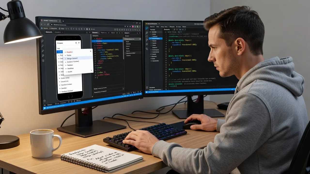
We restore broken mobile menus and hamburger nav layouts so Australian visitors can reach contact, book, and shop pages without fighting the header. Ideal when the desktop site looks fine but phones show a frozen icon, empty drawer, or overlapping content.
What You'll Get
- Root-cause nav diagnosis - We isolate CSS, JS, theme, or plugin conflicts driving the broken hamburger behaviour.
- Responsive menu rebuild or repair - Working open/close, focus states, and readable link lists on real phone widths.
- Breakpoint alignment - Media queries and container rules tuned so the toggle appears only where it should.
- Scroll-lock and overlay cleanup - Body scroll, z-index stacking, and backdrop layers fixed so the page does not freeze after close.
- Accessibility pass on the control - Labels, keyboard reach, and touch target sizing improved for everyday users.
- Device verification notes - Clear before/after notes across common iOS and Android viewports used in Australia.
Serving Australia & surrounds
Australian buyers overwhelmingly browse on phones—especially café-strip retailers, strata-office service firms, and regional operators who share links during freight peaks or school-term booking rushes. A hamburger that fails on a small screen quietly kills enquiries even when the desktop header looks polished. We work remote-first across metro and regional Australia, with optional live walkthroughs when your team needs to see the fix on their own devices.
- High-street and strip retailers whose QR and Maps traffic lands straight on mobile product or menu pages
- Clinic and education sites juggling telehealth or enrolment forms where the nav must stay usable mid-scroll
- Fully remote delivery nationwide; screen-share sessions scheduled around Australian business hours when you want hands-on confirmation
How We Work
- Step 1: Reach Out - Tell us the live URL, devices where it fails, and whether the issue started after a theme, plugin, or content update—we listen first.
- Step 2: Tailored Plan - You get a fixed-scope quote for repair depth (single breakpoint patch through full mobile-nav rebuild).
- Step 3: We Deliver - We implement the CSS/JS/layout fixes on staging or a safe path you approve, then verify open, close, and in-page links.
- Step 4: Confirm & Follow-up - Plain-English summary of what changed, optional short maintenance window if another update might reintroduce the break.
Common Issues & How to Fix Them
These are patterns we see repeatedly on Australian business sites—use the checks below before you rewrite the whole theme.
Hamburger icon taps but the drawer never opens
Common after a plugin or mini-cart layer raises its z-index above the menu, or the toggle script never binds because of a JS error earlier on the page.
- Step 1: On your phone, open the site, tap the icon once, then rotate to landscape and back—note whether any panel flash appears.
- Step 2: On desktop DevTools device mode, inspect the toggle button and menu panel; check computed z-index and whether a full-width overlay sits on top with pointer-events blocking taps.
- Step 3: Temporarily disable the newest plugin or custom header script; if the drawer opens cleanly, you have confirmed a stacking or script-order conflict—re-enable one by one to isolate it.
Menu opens, then the page cannot scroll and the close control does nothing
Often caused by a body/html overflow:hidden lock that is never removed, or a duplicate click handler firing on theme and page-builder scripts together.
- Step 1: Reproduce on mobile: open menu, try scrolling the background, then tap outside and the X/close control separately.
- Step 2: In DevTools, watch the body and html elements while toggling—if overflow stays hidden after close, remove or correct the class the script should strip (often is-open, menu-open, or no-scroll).
- Step 3: Verify by opening and closing three times without refresh; scroll position should restore and the hamburger should return to a closed aria/state visually.
Desktop looks fine but mobile shows a half-width menu or clipped links under the header
Typical when max-width, transform, or sticky header heights differ from the breakpoint where the hamburger appears—especially on sites built for large monitors then “shrunk” for phones.
- Step 1: Measure the failing width (e.g. 390px) and note whether links are cut by overflow:hidden on a parent or by a fixed header covering the first items.
- Step 2: Adjust the mobile nav container to full viewport width, give the panel its own scroll (overflow-y:auto) and top offset equal to the sticky header height, and ensure padding on the last link so it is not trapped behind a browser chrome bar.
- Step 3: Retest at 320px, 390px, and 428px widths plus a real device if you have one; every primary CTA in the menu should be fully tappable without horizontal drag.
When DIY is not enough (urgent, unsafe, recurring, or burning time), book Fixwebnode for direct professional support—no freelancers, bidding, or marketplace noise.
Why Choose Fixwebnode
We are a direct provider: infrastructure-grade web fixes with human, jargon-light explanations so owners and office managers across Australia can approve changes confidently. You speak with the people doing the work, get fixed quotes, and leave with a menu that behaves on the phones your customers actually use.
- ✓ Hands-on responsive CSS/JS repair experience across WordPress, custom themes, and page-builder headers
- ✓ Remote delivery tuned to Australian business hours with clear staging-to-live paths
- ✓ Emphasis on real device behaviour—not just “looks okay” in one desktop emulator width
Expert Insights
On many Australian retail and services sites we audit after a “summer campaign” theme tweak, the hamburger fails only on iOS Safari when a promotional bar is injected above the header. Desktop emulators miss it because they never add the extra sticky offset. Good: the mobile panel’s top position is calculated from the combined height of promo bar + main header, and the toggle’s hit area stays at least 44×44px with a clear label. Bad: hard-coding top:60px for the drawer while a 36px announcement bar appears only on public holidays or sale weekends—suddenly the first menu item sits under the bar and looks “broken,” and staff blame the phone. Before every seasonal banner, re-measure header stack height at the exact breakpoint where the hamburger appears, and store that offset in one shared CSS variable used by both the bar and the drawer.
Tools & Technologies
Chrome/Safari device mode and real iOS/Android checks, responsive CSS (flex/grid, clamp, custom properties), vanilla JS or theme-native menu scripts, WordPress theme/child-theme and common page-builder headers, z-index and stacking-context debugging, basic accessibility attributes on toggles, staging/deploy workflows safe for live small-business sites.
Perfect For
Australian small businesses, clinics, education providers, and operators whose customers live on mobile—especially when a recent redesign, plugin, or promo bar broke the hamburger. Also suited to teams who need the technical fix plus a calm explanation for non-technical staff. Remote-first across Australia; contact us when the nav is costing calls and form fills.
Ready to restore mobile navigation? Call 0421498927 or continue at fixwebnode.com.au/contact-support.
Choose a package
Single-breakpoint hamburger repair for one live site with core open/close and overflow fixes.
Full responsive menu repair across common phone widths plus scroll-lock and header-offset cleanup.
Comprehensive mobile nav rebuild, cross-device QA, accessibility pass, and short post-fix watch window.
FAQ
We deliver this service remote-first anywhere in Australia. You share the URL (and staging access if you have it), we diagnose and fix the menu, then walk through results on a call or screen-share during Australian business hours. On-site visits are not required for hamburger and responsive nav repairs.
A live URL, examples of devices or screenshots where the menu fails, and admin or staging access if the fix must go through your theme or builder. If the break started after an update, tell us roughly when—that speeds isolation of plugin or header conflicts.
Our scope targets mobile breakpoints and the hamburger behaviour. We keep desktop layout stable unless you ask us to align both. Standard and Premium packages include explicit checks so desktop mega-menus or horizontal links are not accidentally regressed.
Yes. Packages are fixed scopes of our direct service: Basic for a focused repair, Standard for multi-width cleanup, Premium for rebuild-level work and deeper QA. After we see the URL we confirm the best fit so you are not guessing mid-project.